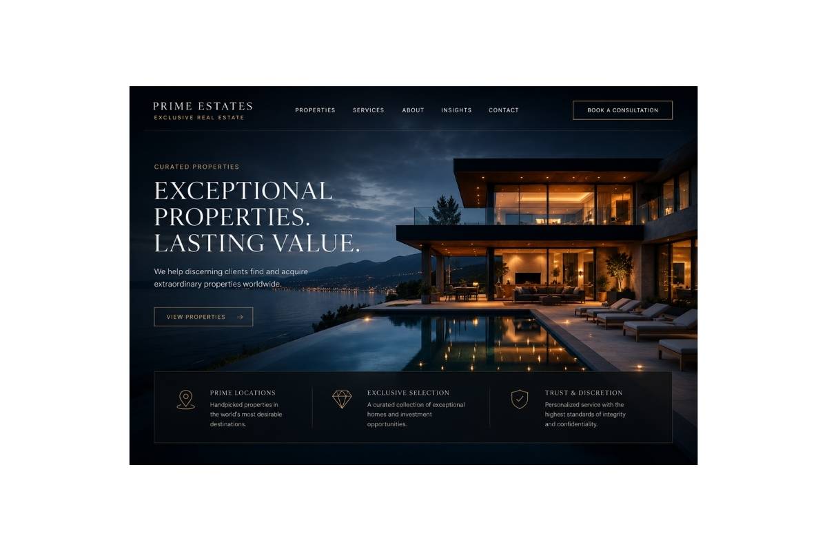
Landing Pages
Focused one-page websites for services, consultants, property offers and small businesses that need a strong first impression fast.
TITOV DESIGN creates refined, responsive websites for businesses that want to look trustworthy, premium and professionally established online — with clear communication, structured delivery and no agency confusion.
A website should not feel confusing, unfinished or cheaply assembled. TITOV DESIGN creates refined digital presentation for businesses that need to look clear, credible and professionally established from the very first second.
You deal directly with the person shaping your website. No confusing agency layers, no endless handovers and no feeling ignored.
Clear package, clear scope and clear revisions before work begins, so there are no hidden surprises later.
Your website is adapted for desktop, tablet and mobile so your business feels professional wherever the visitor finds you.
Most visitors decide quickly whether a business feels serious. The goal is simple: a website that looks refined, explains your offer clearly, works smoothly on mobile and gives people confidence to contact you.
Focused one-page websites for services, consultants, property offers and small businesses that need a strong first impression fast.
Clean multi-page brochure websites with clear service sections, contact flow, trust signals and polished mobile presentation.
Headlines, section order and visual hierarchy shaped around what visitors need to believe before they send a message.
Desktop elegance and mobile control, including sticky navigation, a language switch placeholder and a smooth burger menu.
Many business owners hesitate because they have heard the same stories: hidden fees, poor replies, unfinished work and confusing technical language. TITOV DESIGN is built around the opposite.
Your package and scope are discussed clearly before work begins, so the project does not turn into a chain of unexpected extras.
Communication stays direct and simple. You know what is happening, what is needed from you and what the next step is.
The design is adapted around your business, your offer and the impression you need to create — not copied into a generic layout.
You do not need to understand code, hosting or web jargon. The process is explained in clear language and kept manageable.
A weak website quietly lowers trust. It can make a serious business look smaller, cheaper or less organized than it really is. The work here is to close that gap.
The business may be good, but the first impression is not helping.
Visitors check your business on phones first. The mobile experience must feel controlled and credible.
The goal is not noise. The goal is calm confidence, clear structure and a premium business signal.
Three straightforward packages for businesses that want a polished website without a confusing sales process, vague promises or agency-style surprises.
A clean starter website for a small business, individual service or simple offer that needs to look credible online without unnecessary complexity.
A stronger website for businesses that need clearer positioning, more trust sections and a more complete online presence.
A fuller website for established businesses that need more pages, stronger explanation, better structure and a more authoritative presentation.
The visual language is restrained and refined, but the message stays clear: your business is real, reachable, organized and safe to contact.
No technical confusion. No aggressive sales process. Just clear communication, transparent packages and a refined website adapted to your business.